 Summary:Never paint your visitor into a corner. Never leave your visitor hanging. If you don’t offer everyone who visits you an opportunity to take another step towards you, you’re doing yourself a disservice.
They say that the Internet is endless, that there is more content online than anyone can ever consume. Why, then, are there so many dead ends? Why do I constant make it to a contact page only to discover a puzzle, a test? Why do I ever click on a link only to reach a 404 error? How do I get all the way to the end of an article without ever really knowing anything about the author — or how to make content (even newspapers gladly give out their reporters’ email addresses, why are you so special that you refuse to receive unsolicited email? Are you already fully sold — booked — through 2016? I thought now).
Open a Window
 In life, “when god shuts a door, he opens a window.” When it comes to your online band, you’re the lord of the manor and it’s up to you to choose which doors are unlocked and that all the windows are open for your visitors.
According to Kahlil Gibran, “if you love somebody, let them go, for if they return, they were always yours. If they don’t, they never were.” The same can be said about your guests online.
Your online properties, including your blogs and social media profiles, are your own personal Tomorrowland. Within the boundaries of your platforms, you have all the freedom to do anything that you see fit in order to give your visitors the best visitor experience possible.
Your Own Personal Tomorrowland
Even more, you might not have the best understanding of the true limits and boundaries of your online home, be it your WordPress or Drupal install, your Squarespace or Wix website, and even little hacks that can help bring your YouTube, Tumblr, Facebook, Twitter, Google+, and LinkedIn profiles inline with your brand.
Never keep your visitor wanting more and not giving it to her. If you visitor bounces, it’s your fault. If your visitor can’t find what she needs when she arrives at one of your online properties, it’s on you: you’ve either misrepresented yourself and your capabilities, which is on you; or, you’ve created an experience that alienates your visitor: on you; or, maybe you’ve made it just difficult enough to take the next step (contacting you) or find more information (I enjoyed this post, who wrote it and how can I reach him?) that they hit a wall, reach a dead end.
YouTube
 Did you know that you can load up your YouTube channel with links to all your other social media and web properties in addition to offering you a lot of space to share everything about you and your brand on the About Page?
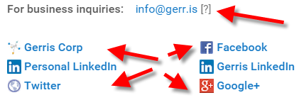 Check it out, there’s a lot of opportunity there.
Be sure to include some information about you and a link to your site in every description on every one of your videos — YouTube converts URLs into hot links when you add them into your YouTube descriptions.

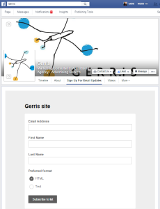 Aside from all the “about us” information that Facebook Pages requests you for when you set it up, you can add a call to action button which will allow you to add one of seven calls to action, including Book Now, Contact Us, Use App, Play Game, Shop Now, Sign Up, and Watch Video.
I am using the Contact Us call to action on my Gerris page, which really just links back to my contact page on the Gerris site. Handy enough.
I have also connected my MailChimp account with Facebook, adding a Sign Up for Email Updates tab on my Facebook page as well, adding a form directly to Facebook.
Google+
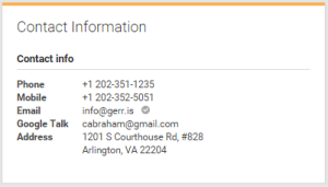 Assuming people actually use Google+, there’s a lot you can add to your about page on Google+ Pages — and I think the more, the better.
In fact, if you have a YouTube page then you should have a Google+ page.
If you want to to help Google define your pastime as a business endeavor worthy of indexing and sharing via Search, you should do 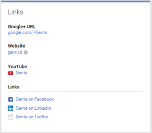 everything you can to pour your all into Google+ and make sure it’s securely stitched together with your YouTube, the number two search engine after Google itself.
If you’re smart about it, you can own your brand like I do with www.youtube.com/gerris and www.youtube.com/chrisabraham in addition to google.com/+ChrisAbraham and google.com/+Gerris, which is pretty cool and couldn’t hurt as Google eventually abandons Google+ but allows me to keep the +Gerris and +ChrisAbraham links through to their next endeavor.
Website
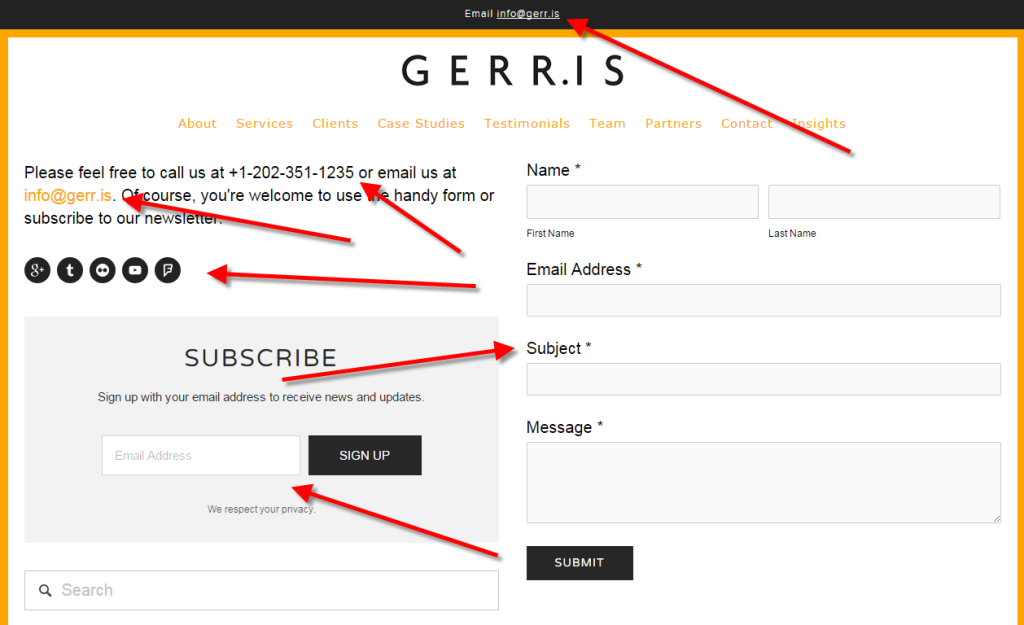
For me, I make sure every page has some sort of contact info or way to contact me directly — and usually more than one. I don’t leave that just to my Contact Me page.
I try to embed inline email forms on as many pages as I can, usually at the bottom. I ignore CAPTCHAs and other Turing tests and allow contacting me as simple as possible. Some of my best clients are color bling or have terrible vision — like all old rich white men — and so making them read a swirly word or a house number is just torture so I’ll be the tortured one in this scenario and I’ll suffer pans and pans of spam message gravel with the understanding that I will also come up with some gold nuggets every once in a while as well.
Don’t let your hatred of spam or spammers or spamming or unsolicited attention or even PR pitches from me turn you off to actually receiving your inbound leads. You’re doing inbound marketing for a reason so stop cutting off your pretty little nose to spite that gorgeous mug if yours, your beautiful online brand.
You can lead a horse to water but don’t make it fill out a CAPTCHA before it can drink.
Go git ’em, Tiger!


