I have been doing a lot of website audits recently, helping companies figure out how to optimize their websites for search. Even in 2015, a majority of the websites I audit are not mobile-compatible. Many of these sites have user interfaces (UI), site architectures, and content management services (CMS) that have not changed in a decade. What these sites do share is that they don’t have either mobile-optimized “second sites” or responsive web design (RWD).
According to Wikipedia, “RWD is an approach to web design aimed at crafting sites to provide an optimal viewing experience—easy reading and navigation with a minimum of resizing, panning, and scrolling—across a wide range of devices (from desktop computer monitors to mobile phones)”
While responsive design isn’t the only way of accommodating mobile visitors, it’s essential to address mobile visitors immediately because more of us are visiting your sites not when we’re at a desk, sitting at our office desktop or home office laptop, but rather in bed, tapping at our tablets, or while at the DMV awaiting our turn, or when an In Real Life (IRL) conversation produces a question that demands an answer In Real Time (IRT) and it’s not the family Dell desktop where the curious go, it’s an iPhone or an Android. So, what are you going to do?
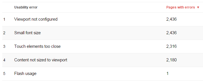
“So, what’s the big deal?” you ask, “I can access all of the pages I want with all my devices by dragging around my site, pinching and stretching to the parts I want, and then clicking and exploring. So why do I need to change?” Well, for two reasons: Google wants you to change and considers your lack of support for mobile devices to be a “Usability Error” (see below).
A very large part of succeeding in Google Search is to accommodate Google every chance you get. And, if Google is trying to help you, via Google Webmaster Tools, by telling you your site is slow or has usability errors, it’s really not a suggestion, it’s a warning.
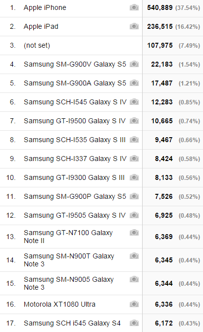
Another reason to revise your site’s user interface is because a growing proportion of your visitors are coming in with very small screens — check this out:
320×568, 360×640, 320×480 pixels? Folks aren’t buying as many tablets and the iPhone 6+ and Galaxy Note 4 are not yet ubiquitous. Even the most generous tablet screen isn’t perfect for PC-optimized websites. In my example, there are still quite a few visitors who are coming in via very generous desktop and laptop screen. Here’s a better example, showing that over 45% of all the visitors to this very popular website are visiting via mobile devices, be it phone or tablet:
Here’s the same date through a more general filter: desktop, mobile, and tablet, with a total of 46.78% coming in from a mobile device.
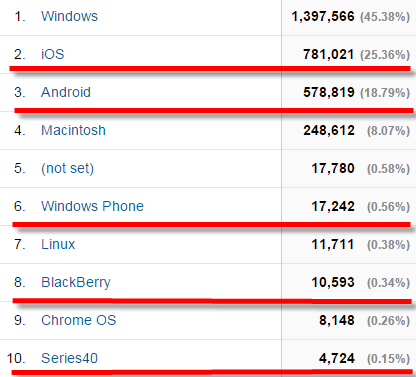
And, of those mobile devices, you can drill down a little more: iOS for the win, as we all know — at least for this website:

![]() What is responsive design? Well, you’ve seen it before when you visited a website via your phone or tablet and seen what’s called a “hamburger menu” like the one to the right. A responsive designed website template often does a terrible job of maintaining the look and feel you wanted when you first designed your brand and your website because it generally gets out of the way of your content. It treats content like water and just flows around what you are saying. Responsive web design also does a terrible job with pop ups and “may I help you” windows and those “please sign up for our newsletter” popups so you’ll need to consider other ways of engaging your visitors — or just try to find a middle ground.
What is responsive design? Well, you’ve seen it before when you visited a website via your phone or tablet and seen what’s called a “hamburger menu” like the one to the right. A responsive designed website template often does a terrible job of maintaining the look and feel you wanted when you first designed your brand and your website because it generally gets out of the way of your content. It treats content like water and just flows around what you are saying. Responsive web design also does a terrible job with pop ups and “may I help you” windows and those “please sign up for our newsletter” popups so you’ll need to consider other ways of engaging your visitors — or just try to find a middle ground.
That said, the traditional hamburger menu responsive design that I have as a default on my site, Gerr.is, via Squarespace, isn’t the only way to address mobile accessibility and optimization. Newspapers have been doing this for years and are still able to maintain a corporate look and feel and are willing and able to maintain corporate branding and newspaperiness while being able to deliver content to everyone, from the most fancy executive retina monitor all the way down to the Apple Newton MessagePad 2000 (yeah, I love that — memories!).
Personally, I am more afraid of what Google will do to my ranking in Google Search than I am of people not visiting my site if it’s not mobile-ready or mobile-friendly; however, as more and more of your competitors transition from traditional PC-centric-designed templates and website interfaces based on top-banner, left-navbar, right navbar, content body, and footer to a more fluid, context-aware, interface that allow swiping and other traditionally smartphone- and tablet-centric navigation methods, fewer and fewer of your visitors will be willing to put up your oversized and itsy-bitsy-tiny-text content page and will continue looking — and bookmarking — sites that are easy and simple to navigate from the devices they use. And, since those same sites look great from desktop browsers and since devices like Androids save their bookmarks over to every other Chrome browser, then the sites that are prefered from their iPhone will also be the sites they visit while they should be working as well.
Even more intimidating is the suggestion that Google will soon only show responsive and mobile-ready and compatible (as far as Google recognizes, not a proprietary solution some geek sold you) sites in their search results when someone queries Google search from a table to smartphone.
So, damned if you don’t, damned if you don’t, be it by your visitors or by the spiders and bots who visit on an hourly basis from Google and Microsoft.
I really think you need to do it now, anyway. If you haven’t updated your website’s look and feel in at least five years, you’re really slacking. Don’t worry, Google’s become a lot smarter than it used to be when it comes to shifting your architecture or changing your link structure (though be careful about your links if you’re heavily linked-to — Wikipedia really cannot ever change its link structure as there are billions of links already stitched in and any change would really disrupt the entire Internet), especially if your site supports Sitemaps (oh, don’t tell me your site doesn’t have a dynamically-generated Sitemap that you’ve told Bing Webmaster Tools and Google Webmaster Tools about? Really? It’s 2015!).
Well, this article is just a plea and not a howto. If you want to learn all about mobile-optimized website design and responsive website design, please check out Brad Frost’s big list of Responsive Resources for an exhaustive list.
Good luck and go git ’em, Tiger!


