Everyone knows that you must place the most important content at the top of the page, right? Everyone knows that you should write like newspaper reporter. Put the most important stuff in the headline, don’t bury the lead, blah, blah, blah. And especially–don’t put important stuff “below the fold.” Below the fold once meant that you keep the good stuff on the upper half of a broadsheet newspaper page, but on the Web it has come to mean that you put the best content at the top of the screen so that people don’t need to scroll down to see it. And I knew all of that. At least I thought I did.

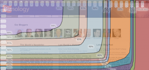
My friend Robin DeCato-McCarthy from Converseon alerted me to a new tool from Google that brings this home with shocking immediacy. If you haven’t seen it, check out the Google browser size tool. It’s such a simple but important idea–put any URL in and it will show you what percentage of browsers see what parts of your screen. Here is what it showed for the Biznology home page:
The page looks OK (if anyone wants to help the design-challenged with a GOOD home page, please volunteer), but what I forgot is that it isn’t just that you need to keep things at the top, but also (duh) to the left. Now, I knew this, I swear. But I wasn’t really thinking about it and doing anything about it. That’s the point.
By seeing it on the screen, it really changes the way you think. And seeing the actual percentages of how many people you are leaving out really makes it hit home. So why does a supposed expert like me need this kick in the rear to actually think through what i allegedly already know?
I think that it happens to all of us. We know what our sites look like. We look at them every blessed day, right? But guess what? We look at them on our own screens. And, drum roll please, do you think that your screen might be a touch larger and better than the average visitor looking at your site?
If you own a Web site that you care enough about to read this article, that already puts you in the upper 10% of the tech-obsessed, whether you think of yourself that way or not. You are more likely to have a big monitor. You are more likely to have a second monitor. You are more likely to assume that everyone sees what you do.
And there is another problem. If some of your visitors are using cell phones to look at our site, you might not know what they see. Because even though you did look at your site once with your own cell phone to make sure it was OK, you probably don’t actually use your site on your cell phone. (And, honestly, do you have a better cell phone than a lot of your visitors, for all the same reasons you have a better computer monitor?)
Some of you might say, “C’mon, anyone with a screen that small will just scroll, right?” Well, no. Sure some of them will scroll, but some of them won’t. And are you OK with losing the ones who won’t? Just check pout the percentages on the screen shot above. Are you OK with losing even 2% of them just because your BUY button doesn’t show up on their screens?
Sometimes the simplest stuff has a big impact. Try out a few key pages from your site in the Google browser size tool and see what you think.


